TA
Unlocking knowledge through creative design
Pocket Finance
Responsive Design Project
The problem:
Many young adults struggle with money management. In interviews, some confess they didn't understand applying for a credit card until college or even after. This causes poor spending habits to occur.
The goal:
This finance-guide app will help users learn how to develop good financial skills, which will affect many young adults and those struggling with poor spending habits by offering an easy-to-navigate app that will offer simple explanations about managing one’s finances.
User Research
Identify Pain Points
1
Access
Lack of apps that actually teach users how to manage their money.
2
Functionality
Some budgeting apps don’t let users connect their bank accounts, and they have to log their spending in manually.
3
Services
There aren’t any apps that provide an umbrella of topics: budgeting, credit, and investing.
4
Visually appealing
App needs to look fun and inviting, as dealing with money is usually the opposite.
User Feedback
"Establishing good money habits as soon as possible is important to me."
"I didn't even get a credit card until after college, and figuring out how to build credit was extremely confusing."
Ideation
Crazy 8s


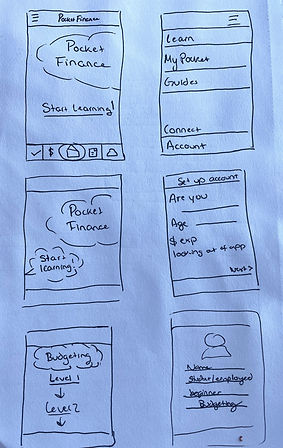
Paper Wireframes
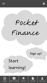
Low-Fidelity Prototypes

Fun designs for appealing visuals
Bottom nav bar for easy user access
Users can easily switch between My Pocket screens
Users can customize how they want their budget graph to show.

Usability Study
I conducted two rounds of usability studies. Findings from the first study helped guide the designs from wireframes to mockups. The second study used a high-fidelity prototype and revealed what aspects of the mockups needed refining.
Below are the top 3 findings from the first study:
1
Clicking on arrows didn’t take user to the next page.
2
Unclear how to fill out account info.
3
Rearrange nav bar buttons.
Mockups
The Home page didn't offer a lot in terms of explaining what the user should expect to get out of it. I made the first page scrollable so users can scroll down and view their options.


High-Fidelity Prototype
I wanted to create something fun and interactive.
So, I went for creating eye-drawing visuals and appealing images.

Dealing with money and finances typically isn't fun: no one likes looking at their bank account or checking their credit.
Accessibility Considerations
1
I used contrasting colors to aid in accessibility, and I relied on tools to ensure the high-contrast colors.
2
I used icons and labels to each call-to-action feature to enforce users’ understanding on what to click and where it would go or what it would do.
3
I made headings clear in what order they should be read and to help distinguish what would be the focus on each page/section.
Next Steps
“Love the colors and the flow of everything … I like how many different options there are for each user.”
Takeaways:
I learned how complex designing for responsive web apps can be, especially starting from a mobile screen first and building up, which was a different approach compared to my last design.
1
First, I’d like to conduct an additional usability study now that I’ve adjusted the mockups and altered the home screen. I would also like to conduct a usability study for the desktop design instead of just the mobile design.
The next step would be to add a Connect page to the app. I like the idea of users connecting with peers and seeing how far along they are in their progress through the courses. It’d add another fun element to it.
2
3
Finally, I'd like to add more pages for the “Template” section so users can navigate to them and provide feedback.
.png)